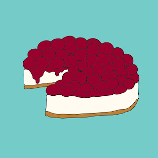
I am researching food illustration styles to help me decide on a style for my own.
I think that these work well in terms of communicating their respective foods, although I think that aesthetically they are a little flat - textured areas or a less strict quality of line could make them a little more visually engaging and more friendly - which is what I am trying to achieve.
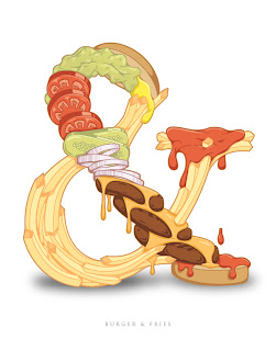
I came across these food ampersands which I absolutely love and wish I had thought of myself!
I find this hyperreal bagel illustration both aesthetically pleasing and far too intense at the same time. It is not a style that I am going for, but I think it is interesting. I can't decide if it makes me salivate or makes me want to puke....
I like these illustrations for their layout as well as the style of illustration. I have been playing with layout of multiple illustrations for the identity of the recipe collection and potential front cover.


No comments:
Post a Comment