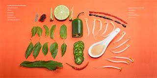
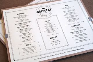
I am looking at how illustration and image can compliment a piece of recipe information, whether it be an information graphic or simply decorative. I want my book or cards to be image heavy.
I think both these styles of image are a really interesting way rather than simply creating an illustration of the finished meal/instructional illustrations.
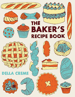
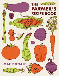
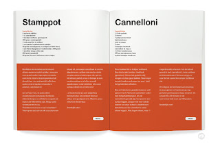
I like these layouts - they are similar to the arrangement designs I have done so far. I also like the style of illustration - simplistic line with flat fill colours which I think look more professional than say a watercolour painting would. I have been struggling with whether to use a restricted colour palette for my illustrations - to match the red white and blue of the logo, or whether to broaden my colour palette to suit the foods illustrated. I think that although these colours (below) aren't correct for the foods they represent, it makes a really interesting slightly more stylised and playful illustration. I think as long as the illustration is clear in what it depicts by way of characteristics, the colour becomes less important.







No comments:
Post a Comment