Showing posts with label paper engineering. Show all posts

Tuesday, 13 December 2011

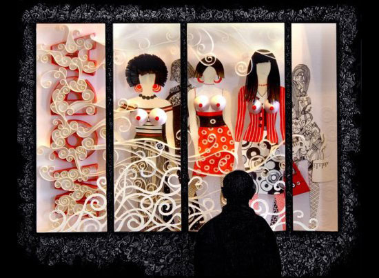
McDonalds menu - paper cuts


I think that this paper cutis really interesting - what I find particularly interesting is the way that it is put back into 2D. I like the use of a realistic texture behind the paper cuts. This is a good example of a paper cut in context.


Sunday, 27 November 2011

Michal Sycz - Various work

These are various pieces by Michal Sycz. He works with 3d design a lot - both digital and crafted. I think that the way that he uses layers works well to bring the type into the 3rd dimension - and then back to 2d when translated across to print.

minjungkim


Minjung Kim is the artist who created the cover for the Fedrigoni Imaginative colours selection tool. She is Korean-born, and fuses oriental and western techniques to create these really interesting pieces of paper artwork. She uses rice paper - even in the Fedrigoni piece, but exploits the colours of the range.


Wednesday, 9 November 2011

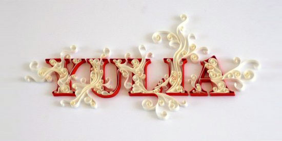
Yulia Brodskaya

Yulia Brodskaya is a Russian paper illustrator currently living and working in London. I think that her way of working with paper works really well in helping her to achieve a recognizable style within this area of design, in the same way that Rob Ryan's style is so distinctive. I want to keep my own style of working with paper open at this stage, as I feel i am still finding my strengths in this area and at the moment struggling to communicate my hand drawn illustrative style through paper crafting in the way that I want.
yulia brodskaya%27s paper-cut illustrationse87410bfd47be163007ed8f4005acea9.jpg / Gil Cockeryulia brodskaya%27s paper-cut illustrations

Paper Runway magazine

Paper Runway is a quarterly magazine that offers you a mix of paper products, party inspirations, features about the biggest paper sculptors, artists, illustrators, creators and small DIY projects. I discovered this magazine whilst researching Mr Yen who did a cover for them. The impression I get through my research into paper engineering is that 'hand made' is very much both the aesthetic and the practice that is important to the designers that work with it as a process. I feel that perhaps my plans to laser cut my designs means that I am bastardizing this practice in some way - however due to my personal time restrictions and the fact that this work is essentially a pitch to Fedrigoni, I see no alternative that will deliver the results I want.Image of Paper Runway Entertaining (download only)Image of Paper Runway Ever AfterImage of Yearly Subscription Starting Issue 2
Image of Yearly Subscription Starting Issue 1

Mr Yen

I have been looking at Mr Yen, and ex Lcad BAGD student's work. His work is very much centered around paper cuts. What I particularly like about his work is the way that he has photographed it - and his use of textures (i.e. wood) to create a more interesting image and to put the paper cut into more of a context. I think that with what I am doing it is important to exhibit the Fedrigoni paper range as much as possible through the brief - (rather than other stocks or surfaces) - however I think if the surface or background helps to set off the paper then it could be beneficial.

Monday, 7 November 2011

Rob Ryan

I am a huge followerd of the work of Rob Ryan and I'm sure this partly where my inspiration has come from to work with paper in an illustrative way.

Rob Ryan's studio....

I read about Rob Ryans working process which I think could be valuable when I start designing and making. His paper cuttings vary from tiny to huge, each one starts as a pencil drawing that is cut out (usually by hand) then sprayed with colour. Some of them rather than cut become silkscreen prints. I think that it is interesting that a lot of them are sprayed with colour after they are created rather than made from coloured stock which is what I had imagined until this point. I really like the way that photographing the paper cuts brings the otherwise usually flat images to life. Lighting and photography will probably play a large part in how my pieces appear.


Past/present Fedrigoni entries

These are some past and present entries to Fedrigoni's YCN brief. I think that it is important for me to look at what kind of work other students are producing so that I can try my best to create something original. I am glad I have looked into other peoples work as I can see some of my initial ideas - such as oragami - have already been executed and exhausted really.


I particularly like this entry and the way that they have used paper engineering in the format of a publication.


As far as I am aware so far I have not found any paper engineered type as part of a Fedrigoni YCN campaign idea.... if I find some it won't put me off as I feel confident in my personal ideas that is should be successful and different from whatever else is out there.

Helen Friel


Helen Friel is a self branded 'paper engineer' which I think is a brilliant way to coin what she does and what I want to do for my Fedrigoni brief. In terms of format I am undecided, only that I know I want to create some type driven work out of paper. The format of the deliverables will almost definitely be print as they have specified this in the brief. 
I think it is interesting how Helen Friel plays with format, like in this design for Edgar Allen Poe's 'The Imp of perverse' where the reader has to interact with the story by tearing carefully considered areas of text away to reveal the next part of the story. This kind of format could work as part of the promotion for Fedrigoni.


I like the way that this entire cover is made up of paper elements.


Working in 3D, and using photography to document the images accordingly will play a big part in this project for me.


Trip to Saltaire

I went to Saltaire yesterday - partly for a break from the city for a couple of hours and partly to see the Hockney gallery again as I haven't been this year. Typically I spent more time in the amazing shop than anywhere else photographing things that I can't afford to buy and things that I just liked.

I absolutely love this typographic book cover. I think that the ribbon works really well as a guide - directing your eye down the cover.

A lot of the work I looked at will be really helpful for my research for both my type brief and my Fedrigoni brief....


I plan to make my own christmas cards this year and these designs I especially like. I plan to screen print my cards - partly to keep costs as low as possible but also for the aesthetic of hand made. What I particularly like about these cards are the colour choices - especially the orange and blue snowman and the green and pink/red ones. I like that they are slightly less obviously festive colours such as red green gold etc. 


Massive sandwich I ate later that day.....


woah