Showing posts with label illustration. Show all posts

Sunday, 13 November 2011

Food illustrations

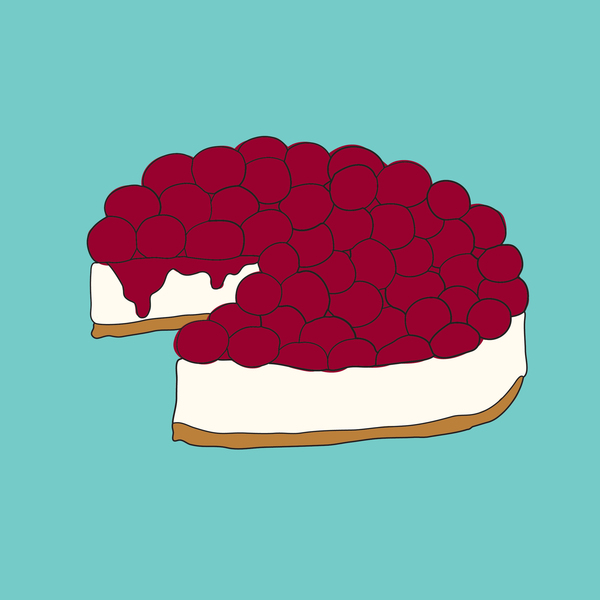
I am researching food illustration styles to help me decide on a style for my own.
I think that these work well in terms of communicating their respective foods, although I think that aesthetically they are a little flat - textured areas or a less strict quality of line could make them a little more visually engaging and more friendly - which is what I am trying to achieve.

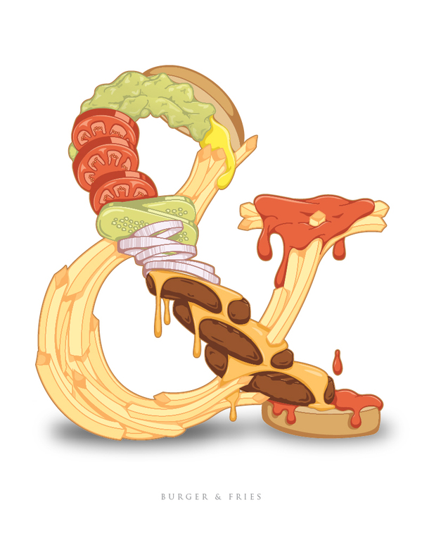
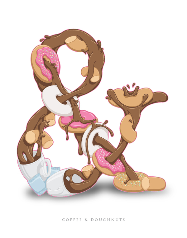
I came across these food ampersands which I absolutely love and wish I had thought of myself!




I find this hyperreal bagel illustration both aesthetically pleasing and far too intense at the same time. It is not a style that I am going for, but I think it is interesting. I can't decide if it makes me salivate or makes me want to puke....


I like these illustrations for their layout as well as the style of illustration. I have been playing with layout of multiple illustrations for the identity of the recipe collection and potential front cover.


Tuesday, 8 November 2011

Akiko Stehrenberger

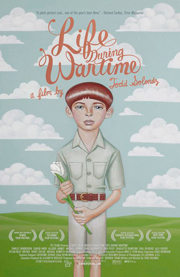
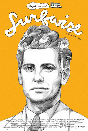
I really like these two posters by Akiko Stehrenberger. I think that they are good examples of how illustration and bespoke type can work so well together. This is the style of illustration I want to use as a starting point for my Fedrigoni brief - and then bring into the third dimension using paper engineering.


Monday, 7 November 2011

toilet wall illustration

Strange but lovely illustration on a toilet wall I saw this weekend....

Trip to Saltaire

I went to Saltaire yesterday - partly for a break from the city for a couple of hours and partly to see the Hockney gallery again as I haven't been this year. Typically I spent more time in the amazing shop than anywhere else photographing things that I can't afford to buy and things that I just liked.

I absolutely love this typographic book cover. I think that the ribbon works really well as a guide - directing your eye down the cover.

A lot of the work I looked at will be really helpful for my research for both my type brief and my Fedrigoni brief....


I plan to make my own christmas cards this year and these designs I especially like. I plan to screen print my cards - partly to keep costs as low as possible but also for the aesthetic of hand made. What I particularly like about these cards are the colour choices - especially the orange and blue snowman and the green and pink/red ones. I like that they are slightly less obviously festive colours such as red green gold etc. 


Massive sandwich I ate later that day.....


woah