
Showing posts with label Olympicnic. Show all posts
Showing posts with label Olympicnic. Show all posts
Thursday, 8 December 2011
Waitrose - Round Two
After feeling outraged having been thrown out of Waitrose and later Marks and Spencers last week on my photo taking expedition, I decided that it was time for round two. This time I only took my mobile phone as a camera as I realise I need to be more subtle if I am going to get away with it. I could use the co op shots, but I would ideally like to have Waitrose products and shelving in the images to make it seem as real as possible. Also it is useful for me to see where and how they use their in store graphics to inspire me as to how I could use mine in their store.

Products to package
Some products I got hold of to re package as mock ups for my picnic brief. I chose products that don't require complex nets as this is not an area that I am interested in designing for.

Online presence
I want to explore the possible web presence for my Waitrose Picnic brief - as this would be an integral part of directing the consumers to product range as well as encouraging people to buy the products when online shopping. At the moment there is a large promotion for the Christmas range of products, as well as online Christmas recipe cards. I plan to mock up both these elements for the Picnic range.


sourcing typeface
I have been researching what font Waitrose use and this was the most conclusive answer I could find! I managed to get hold of Futura Md.


Sunday, 27 November 2011
M&S Photographs
After being removed from Waitrose for attempting to take photographs with a very conspicuous SLR in their store, so I decided to go for a more sneaky approach and use my phone instead and try Marks and Spencer. I took these before asking one of the management whether I could take some with the SLR, but was denied again. Luckily I got these, but I'm not sure if the quality will be fantastic for my mock ups. However, Marks and Spencers shelving units, layout and graphics better represent the ones in Waitrose than the ones in Co-op (which I managed to get a couple of on the SLR), so if the quality is decent I will use these instead.
Tuesday, 15 November 2011
Contacting Blurb publishing
I have contacted Blurb publishing to see if I could get my recipe book design printed and bound for the deadline of two weeks prior to the deadline. I think that this would be a really nice piece for my portfolio if it is possible for them to guarantee it in time.


Sunday, 13 November 2011
Tin packaging
A tin/plastic box is something I hadn't considered until now as a way to package the recipe cards. I like the idea that should the recipe cards be used, lost, discarded or filed away somewhere, then this becomes an additional kitchen/picnicking vessel. It could almost serve as a collectors item - to tie in with the Olympics in GB. This also makes it even more marketable as a gift.
My only concerns are how I would create good quality mock ups for submission and for my portfolio.
Something to research....

Food illustrations
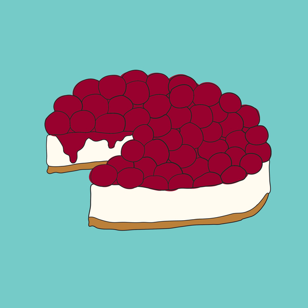
I am researching food illustration styles to help me decide on a style for my own.
I think that these work well in terms of communicating their respective foods, although I think that aesthetically they are a little flat - textured areas or a less strict quality of line could make them a little more visually engaging and more friendly - which is what I am trying to achieve.

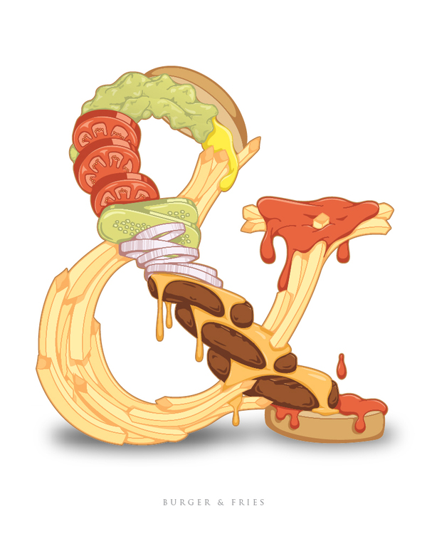
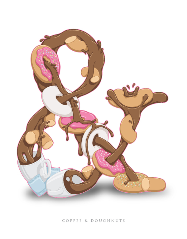
I came across these food ampersands which I absolutely love and wish I had thought of myself!




I find this hyperreal bagel illustration both aesthetically pleasing and far too intense at the same time. It is not a style that I am going for, but I think it is interesting. I can't decide if it makes me salivate or makes me want to puke....

I like these illustrations for their layout as well as the style of illustration. I have been playing with layout of multiple illustrations for the identity of the recipe collection and potential front cover.


Recipe card research


 I have been looking at recipe cards since my decision to consider making cards rather than a full recipe book. This is partly due to the time restrictions - I wanted to get my book printed professionally though a one off publishing company such as Blurb. I thought that this would be a really nice professional piece for my portfolio, however shipping can take up to 21 days, and including photographing the product for my boards, I just don't want to risk not making the time limit. Also, I think that the volume of work required for this would have been more than I could afford. I think that recipe cards allow me to play more with interesting formats such as these....
 I like very much the more hand rendered aesthetic to these cards - which suits the style that I have been working to so far on this brief.
 I like the combination of illustration and text in these examples - illustrations complementing the text where appropriate. I think this will be a good excersise in using illustration in the correct context.

Recipe book/card research
I am intersted in a hand drawn aesthetic for this brief - through illustration and custom type. I think that this design works well in terms of colour but I think that hand rendered type can look childish and less professional than regular type when not executed well. This is what I am working on at the moment - to make sure mine looks both friendly and homely as well as professional.
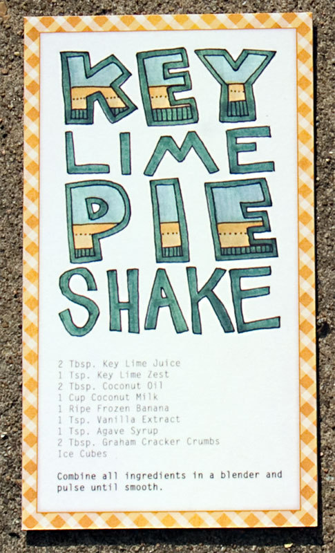
I love this type used in this example, I think that the type really works well with the illustrations - I think that colour and size plays a big part in the hierarchy of elements on the page as well as balancing the composition.

I like the use of real food in this example - I think if I decided to make a book I can incorporate both illustration and photography, whereas if I make recipe cards it might be best to stick to just one form of image making.

I am trying to decide whether to categorise my recipes - ordinarily I would think this would be a good idea, but it depends on how many recipes I decide to design for... Picnic foods is almost a sub-genre in itself and I see less point in breaking it down into categories as it is essentially one course....


I think this vector illustration is really interesting and perhaps something I would like to explore stylistically in a future project.

Successful hand drawn type :

I like the way that this design is laid out for documentation - I need to consider how I will display the product both for point of sale, promotion and for my portfolio. I think that the wood surface works really well in that it suggests a culinary setting which suits the products. Perhaps photographing my work on a gingham rug would be a suitable context for picnicing.


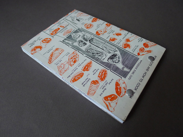
I like the format of this book and the way that the way you read watch page changes - the less information heavy pages being laid out portrait when the publication is landscape.


Subscribe to:
Posts (Atom)