Wednesday 14 December 2011
Tuesday 13 December 2011
McDonalds menu - paper cuts
I think that this paper cutis really interesting - what I find particularly interesting is the way that it is put back into 2D. I like the use of a realistic texture behind the paper cuts. This is a good example of a paper cut in context.
Labels:
Brief 4,
Collaboration,
Fedrigoni - YCN,
ougd301,
paper engineering
Thursday 8 December 2011
Waitrose - Round Two
After feeling outraged having been thrown out of Waitrose and later Marks and Spencers last week on my photo taking expedition, I decided that it was time for round two. This time I only took my mobile phone as a camera as I realise I need to be more subtle if I am going to get away with it. I could use the co op shots, but I would ideally like to have Waitrose products and shelving in the images to make it seem as real as possible. Also it is useful for me to see where and how they use their in store graphics to inspire me as to how I could use mine in their store.
Foil blocking experiments
Chris has been working on the layout for the publication, calendar, invite certificate and tickets for our Fedrigoni brief. We have been meeting each day and discussing the progress of our work so that we are both on the same page about what our final product is going to look like. Today Chris gave me some of the designs for me to experiment with foiling. Most of the designs I can get away with using the laser jet printer in the mac suite but I will have to prepare a screen for the cover of the pack that will contain most of these elements as it is larger than A3. We have chosen to use foiling as it will hopefully give the designs a high-end, print process heavy feel which is relevant to our target audience.
Labels:
Brief 4,
Fedrigoni - YCN,
finishing,
foil blocking,
ougd301
Products to package
Some products I got hold of to re package as mock ups for my picnic brief. I chose products that don't require complex nets as this is not an area that I am interested in designing for.
Online presence
I want to explore the possible web presence for my Waitrose Picnic brief - as this would be an integral part of directing the consumers to product range as well as encouraging people to buy the products when online shopping. At the moment there is a large promotion for the Christmas range of products, as well as online Christmas recipe cards. I plan to mock up both these elements for the Picnic range.
sourcing typeface
I have been researching what font Waitrose use and this was the most conclusive answer I could find! I managed to get hold of Futura Md.
Wednesday 30 November 2011
Research for ep cover
I have been looking at a lof of geometric patterns and design inspired by geometric and angular forms as part of my inspiration for the Warner ep cover. I have also been looking at texture and pattern and using this in small selected areas of the design.
Labels:
additional briefs,
geometric patterns,
ougd301,
Warner EP
Monday 28 November 2011
Research for Warner ep
I have been looking for inspiration for my designs for the Warner ep - I want to create something contemporary and in fitting with the genre of the band and the kind of art work that is associated with these bands.....
These are four pieces of artwork that the band sent me to explain the kind of thing that they like...
Sunday 27 November 2011
M&S Photographs
After being removed from Waitrose for attempting to take photographs with a very conspicuous SLR in their store, so I decided to go for a more sneaky approach and use my phone instead and try Marks and Spencer. I took these before asking one of the management whether I could take some with the SLR, but was denied again. Luckily I got these, but I'm not sure if the quality will be fantastic for my mock ups. However, Marks and Spencers shelving units, layout and graphics better represent the ones in Waitrose than the ones in Co-op (which I managed to get a couple of on the SLR), so if the quality is decent I will use these instead.
Amarilis Typeface
Typeface design by Diego Sanz Salas. I love the patterns translated to onto these letterforms. While they are floral they are not overly feminine and the colour choices give them a south american feel - perhaps remeniscent of the designers Peruvian origins. The colours and slightly geometric remind me of moasic tiles.


Michal Sycz - Various work
These are various pieces by Michal Sycz. He works with 3d design a lot - both digital and crafted. I think that the way that he uses layers works well to bring the type into the 3rd dimension - and then back to 2d when translated across to print.


Labels:
Brief 4,
Fedrigoni - YCN,
ougd301,
paper engineering,
type design
Free Soul
Lucy Molnar - Free Soul type design - I like the geometric elements that make up this design and I think could translate well across a 3d layered design like the one I have in mind for Fedrigoni.


Garito Cafe custom type
This typeface was designed for a popular club in Mallorca by Vicente García Morillo.....

I also like the way that it is photographed - in the sand. It adds an interesting context to the design that is slightly unrealistic but more interesting than simply photographing it in someones hand! I don't think that it necessarily works as well as it could, but it has made me think about how I would photograph the text and how it would make it more relevant or interesting.


I also like the way that it is photographed - in the sand. It adds an interesting context to the design that is slightly unrealistic but more interesting than simply photographing it in someones hand! I don't think that it necessarily works as well as it could, but it has made me think about how I would photograph the text and how it would make it more relevant or interesting.


'Holt' type design
Typeface design by Stella Björg - this reminds me of an idea I had last year when I was going to design a typeface base on wild flowers, before settling on another theme for my type design project. I think that this is absolutely beautiful - and though extremely delicate, I think that this could be adapted into a three dimensional paper design.


Numbers for Con Artist
I absolutely love these numbers created by Anjo Bolarda. I think that a style like this would work really well as a 3d paper type design.
Typeface exploration
These are some typefaces that I have been looking at for inspiration for 3d type. I think that these highly decorative typefaces explain the aesthetic that I want to achieve.
(fonts sourced from MyFonts.com)
(fonts sourced from MyFonts.com)
Labels:
Brief 4,
Fedrigoni - YCN,
ougd301,
type design,
typefaces
minjungkim
Minjung Kim is the artist who created the cover for the Fedrigoni Imaginative colours selection tool. She is Korean-born, and fuses oriental and western techniques to create these really interesting pieces of paper artwork. She uses rice paper - even in the Fedrigoni piece, but exploits the colours of the range.

Labels:
art direction,
Brief 4,
Fedrigoni - YCN,
ougd301,
paper engineering
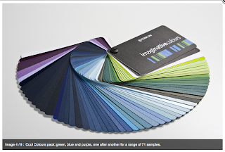
Imaginative colour tool.....
More detailed information about the Imaginative colour tool.....
These sample books are key to the way that the tool functions and could be important when we consider how we promote this function.
I think that we should aim to communicate the four different colour ranges....
Subscribe to:
Posts (Atom)


