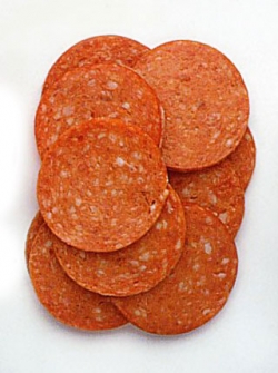
I have been researching for my latest Hyde Park Social brief - to design a freestanding pizza menu/advertisment for the bar. I am looking to retro pizza promotions and old fashioned style imitation logos for inspiration at the moment to suit the retro decor of the social club, and I am trying to avoid the more garish tacky styles associated with pizza.
I like the faded colours of these advertisments. I think it makes them look less tacky than the take away menus you get round Leeds.
I especially like the type on this sign...
I like the shapes of these logos - mimicking the shape of a pizza. I also like the faded effect which makes them look aged.
I really like the ribbon banner and the use of muted tones on this logo. I also like the subtlety achieved by the lack of strong outlines.
Textures I am considering working with :
Red gingham is easily associated with pizza restaurants and I feel can be used in a non-tacky way.
These textures could be used to achieve the illusion of crust and other pizza elements within my design.
Ideas :
Type out of pizza - this is one of my initial ideas (although I wanted to make it out of real pizza and photograph it) - but I decided for an a5 menu this would just not work. It would be an interesting experiment for another project though.
I found this stock image which I really like. I had designed a layout similar myself already. I think that the single piece of pizza is iconic enough to dictate the subject matter of the menu and the shape fits the format (portrait a5) really well.
'Hot Pizza' typeface - I found this typeface which I think looks dated and suits the theme that I am going for.