Showing posts with label Fedrigoni - YCN. Show all posts

Tuesday, 13 December 2011

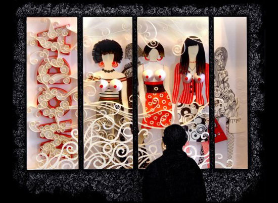
McDonalds menu - paper cuts


I think that this paper cutis really interesting - what I find particularly interesting is the way that it is put back into 2D. I like the use of a realistic texture behind the paper cuts. This is a good example of a paper cut in context.


Thursday, 8 December 2011

Foil blocking experiments

Chris has been working on the layout for the publication, calendar, invite certificate and tickets for our Fedrigoni brief. We have been meeting each day and discussing the progress of our work so that we are both on the same page about what our final product is going to look like. Today Chris gave me some of the designs for me to experiment with foiling. Most of the designs I can get away with using the laser jet printer in the mac suite but I will have to prepare a screen for the cover of the pack that will contain most of these elements as it is larger than A3. We have chosen to use foiling as it will hopefully give the designs a high-end, print process heavy feel which is relevant to our target audience.

Sunday, 27 November 2011

A few more type ideas...


Amarilis Typeface

Typeface design by Diego Sanz Salas. I love the patterns translated to onto these letterforms. While they are floral they are not overly feminine and the colour choices give them a south american feel - perhaps remeniscent of the designers Peruvian origins. The colours and slightly geometric remind me of moasic tiles.

Michal Sycz - Various work

These are various pieces by Michal Sycz. He works with 3d design a lot - both digital and crafted. I think that the way that he uses layers works well to bring the type into the 3rd dimension - and then back to 2d when translated across to print.

Free Soul

Lucy Molnar - Free Soul type design - I like the geometric elements that make up this design and I think could translate well across a 3d layered design like the one I have in mind for Fedrigoni.

Garito Cafe custom type

This typeface was designed for a popular club in Mallorca by Vicente García Morillo.....

I also like the way that it is photographed - in the sand. It adds an interesting context to the design that is slightly unrealistic but more interesting than simply photographing it in someones hand! I don't think that it necessarily works as well as it could, but it has made me think about how I would photograph the text and how it would make it more relevant or interesting.

'Holt' type design

Typeface design by Stella Björg - this reminds me of an idea I had last year when I was going to design a typeface base on wild flowers, before settling on another theme for my type design project. I think that this is absolutely beautiful - and though extremely delicate, I think that this could be adapted into a three dimensional paper design.


Numbers for Con Artist

I absolutely love these numbers created by Anjo Bolarda. I think that a style like this would work really well as a 3d paper type design.


Typeface exploration

These are some typefaces that I have been looking at for inspiration for 3d type. I think that these highly decorative typefaces explain the aesthetic that I want to achieve.
(fonts sourced from MyFonts.com)

minjungkim


Minjung Kim is the artist who created the cover for the Fedrigoni Imaginative colours selection tool. She is Korean-born, and fuses oriental and western techniques to create these really interesting pieces of paper artwork. She uses rice paper - even in the Fedrigoni piece, but exploits the colours of the range.


Imaginative colour tool.....


More detailed information about the Imaginative colour tool.....


These sample books are key to the way that the tool functions and could be important when we consider how we promote this function.


I think that we should aim to communicate the four different colour ranges....


Launch of 'Imaginative' colour range from Fedrigoni

I found the official information about the launch of the "imaginative" colour palette which is what we are supposed to be promoting. This information is not supplied with the brief so I think it is necessary to find out as much as possible about the range....

"Fedrigoni is pleased to present the Imaginative Colours paper selector, an encyclopedia of colour available from the entire Fedrigoni special papers range.

The tool consists of four fan style paper booklets, divided into sections of: warm, cool and neutral colours, containing a total of 262 samples of paper.
The Fedrigoni paper selector is an essential tool for graphic designers to appraise the best shade and suitable surface for their latest projects.

The ultimate toolkit for design and print professionals, who'll soon be wondering how they ever managed without it on their desks, a real source of inspiration for loads of creative, innovative ideas!"

Background information on Fedrigoni


Fedrigoni UK
Overview
Part of the Fedrigoni Group, manufacturers of high quality papers and boards distributed to over 60 countries worldwide.
History
Still a family owned company, Giuseppe Antonio Fedrigoni began paper production in 1888 in the Verona Paper mill,that was subsequently expanded by his son, Antonio.

The three mills (Verona, Varone and Arco) were merged in 1979 to form Cartiere Fedrigoni & C. S.p.A. Since then, Group development has continued with special emphasis on the "converting" sector, with the creation of Arconvert in 1989 and the take-over of Manter SA (Manipulados del Ter SA) in 1993, on European distribution through the dedicated companies distribution companies in Germany (1987), Spain (1989), France and Great Britain (1993). As from the 1st January 2000: the Fedrigoni Group was re-organised, with the transfer of production and commercial operations to the new Fedrigoni Cartiere S.p.A. and buildings operations to Acquaviva S.r.l., while Cartiere Fedrigoni & C. S.p.A. itself became the Group Holding Company.

Client List
Graphic Designers, Printers, Merchants, Greeting Cards Producers, Luxury Packaging.
Market Focus
Environmental Credentials
While maintaining complete compliance with the principles underlying both the development of the company mission and the framing of environmental policies, Fedrigoni has been able to achieve a series of improvements, largely as a result of a proven ability to apply increasingly responsible, ethical approaches to the management of its processes.
With the finest technologies available for improving product quality and efficiency, Fedrigoni has managed to adhere to minimising the potential environmental impacts. Drawing inspiration from the following principles:

Making efficient, respectful use of all natural resources, from water to energy and forestry.
Promoting and insisting on concrete and validated practice of responsible defined and recognisable environmental policies on the part of suppliers, in particular those of fibrous raw materials based on wood originating from forestry. 

Wednesday, 9 November 2011

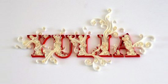
Yulia Brodskaya

Yulia Brodskaya is a Russian paper illustrator currently living and working in London. I think that her way of working with paper works really well in helping her to achieve a recognizable style within this area of design, in the same way that Rob Ryan's style is so distinctive. I want to keep my own style of working with paper open at this stage, as I feel i am still finding my strengths in this area and at the moment struggling to communicate my hand drawn illustrative style through paper crafting in the way that I want.
yulia brodskaya%27s paper-cut illustrationse87410bfd47be163007ed8f4005acea9.jpg / Gil Cockeryulia brodskaya%27s paper-cut illustrations

Paper Runway magazine

Paper Runway is a quarterly magazine that offers you a mix of paper products, party inspirations, features about the biggest paper sculptors, artists, illustrators, creators and small DIY projects. I discovered this magazine whilst researching Mr Yen who did a cover for them. The impression I get through my research into paper engineering is that 'hand made' is very much both the aesthetic and the practice that is important to the designers that work with it as a process. I feel that perhaps my plans to laser cut my designs means that I am bastardizing this practice in some way - however due to my personal time restrictions and the fact that this work is essentially a pitch to Fedrigoni, I see no alternative that will deliver the results I want.Image of Paper Runway Entertaining (download only)Image of Paper Runway Ever AfterImage of Yearly Subscription Starting Issue 2
Image of Yearly Subscription Starting Issue 1

Mr Yen

I have been looking at Mr Yen, and ex Lcad BAGD student's work. His work is very much centered around paper cuts. What I particularly like about his work is the way that he has photographed it - and his use of textures (i.e. wood) to create a more interesting image and to put the paper cut into more of a context. I think that with what I am doing it is important to exhibit the Fedrigoni paper range as much as possible through the brief - (rather than other stocks or surfaces) - however I think if the surface or background helps to set off the paper then it could be beneficial.

Tuesday, 8 November 2011

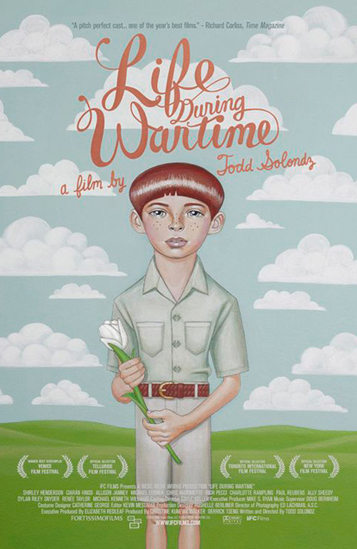
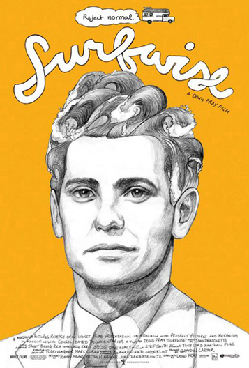
Akiko Stehrenberger

I really like these two posters by Akiko Stehrenberger. I think that they are good examples of how illustration and bespoke type can work so well together. This is the style of illustration I want to use as a starting point for my Fedrigoni brief - and then bring into the third dimension using paper engineering.


Monday, 7 November 2011

Rob Ryan

I am a huge followerd of the work of Rob Ryan and I'm sure this partly where my inspiration has come from to work with paper in an illustrative way.

Rob Ryan's studio....

I read about Rob Ryans working process which I think could be valuable when I start designing and making. His paper cuttings vary from tiny to huge, each one starts as a pencil drawing that is cut out (usually by hand) then sprayed with colour. Some of them rather than cut become silkscreen prints. I think that it is interesting that a lot of them are sprayed with colour after they are created rather than made from coloured stock which is what I had imagined until this point. I really like the way that photographing the paper cuts brings the otherwise usually flat images to life. Lighting and photography will probably play a large part in how my pieces appear.