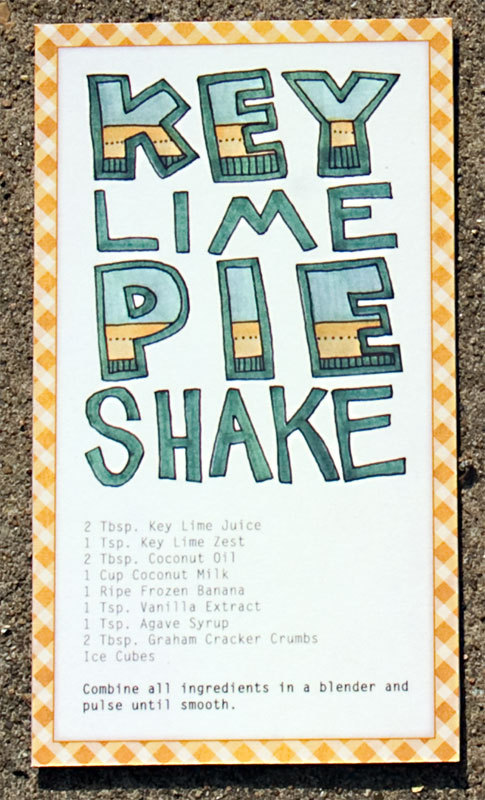
I am intersted in a hand drawn aesthetic for this brief - through illustration and custom type. I think that this design works well in terms of colour but I think that hand rendered type can look childish and less professional than regular type when not executed well. This is what I am working on at the moment - to make sure mine looks both friendly and homely as well as professional.
I love this type used in this example, I think that the type really works well with the illustrations - I think that colour and size plays a big part in the hierarchy of elements on the page as well as balancing the composition.
I like the use of real food in this example - I think if I decided to make a book I can incorporate both illustration and photography, whereas if I make recipe cards it might be best to stick to just one form of image making.
I am trying to decide whether to categorise my recipes - ordinarily I would think this would be a good idea, but it depends on how many recipes I decide to design for... Picnic foods is almost a sub-genre in itself and I see less point in breaking it down into categories as it is essentially one course....
I think this vector illustration is really interesting and perhaps something I would like to explore stylistically in a future project.
Successful hand drawn type :
I like the way that this design is laid out for documentation - I need to consider how I will display the product both for point of sale, promotion and for my portfolio. I think that the wood surface works really well in that it suggests a culinary setting which suits the products. Perhaps photographing my work on a gingham rug would be a suitable context for picnicing.
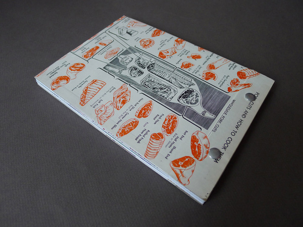
I like the format of this book and the way that the way you read watch page changes - the less information heavy pages being laid out portrait when the publication is landscape.


 I have been looking at recipe cards since my decision to consider making cards rather than a full recipe book. This is partly due to the time restrictions - I wanted to get my book printed professionally though a one off publishing company such as Blurb. I thought that this would be a really nice professional piece for my portfolio, however shipping can take up to 21 days, and including photographing the product for my boards, I just don't want to risk not making the time limit. Also, I think that the volume of work required for this would have been more than I could afford. I think that recipe cards allow me to play more with interesting formats such as these....
 I like very much the more hand rendered aesthetic to these cards - which suits the style that I have been working to so far on this brief.
 I like the combination of illustration and text in these examples - illustrations complementing the text where appropriate. I think this will be a good excersise in using illustration in the correct context.