Rsearching more food/recipe design - both formats, content and aesthetic.
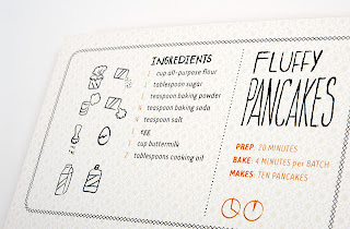
I think these small illustrated instructions work well and I like the size and shape of the recipe cards.
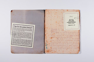
This publication is really beautiful. I like it both for its recycling element and its design aesthetic. The content is printed on tracing paper which is then attached to each page of this old, worn out book. I suppose this is doubly useful in that you could actually write notes on the pages. This is an element that I could consider - blank pages for notes and other recipes that the owner want's to continue adding to the collection....
Some lovely food based type..... I want to produce some custom typography for this project, but I think that something like this would be too much as well as the illustrations, unless I could find a way to link them together in more than one way.
I like this small detail at the base off this recipe card - informing the reader how thick to make the pastry.
As much as I like these practical elements to the recipe cards, I think it is important to restrict my design to a few key themes rather than trying to do everything. The message needs to be communicated clearly.
An interesting format :
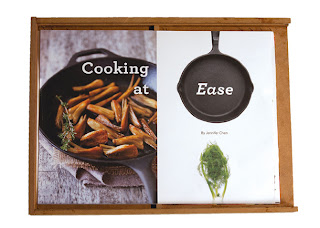
I am looking at sleeve ideas for my cards - I like the aesthetic of brown card or wood as I think it implies a homely rustic feel....
This is a good example of illustrations that are almost entirely functional as oppose to decorative....
I think I need to make sure my instructional illustrations communicate clearly as well as provide the right aesthetic, or else omit them altogether and only use decorative supporting illustrations.
I like the hand drawn type in these designs. The achieve a homely, friendly hand made aesthetic without appearing childish which is what I need to achieve with mine.


No comments:
Post a Comment