PREFLIGHTING
............................
______________
............................
______________
............................
______________
...........................
When creating an indesign file - consider first
the final finished trimmed size of whatever you are designing. (This will determine the page size)
Columns, margins, bleed, slug provide you with additional guides to assist you with your layout.
'Slug' area is for printers marks/trim marks/registration marks/page information. (Things that will be printed but are not part of your layout and will be trimmed off)
A bleed value of 3mm is a good idea.
Red : bleed
Purple : margin
Black : trimmed page
You can edit the page layout etc through the 'layout' and the 'file > document setup'
Everything must be contained by a frame.
Things that need to be considered when using files from :
Photoshop
1) Images must be the actual print size.
2) Images must be in CMYK/monotone/duotone/greyscale.
3) File format - e,g, Tiff, PDF, psd, NOT jpeg, png, gif.
4) Correct resolution - 300dpi always - no need to work at any higher - unless enlarging.
When enlarging - scan the image at 600 dpi.
5) DON'T copy and paste into indesign.
Illustrator
1) Work does not need to be actual size.
2) Must work in CMYK
3) Ai. files
4) Can copy and paste into InDesign
When you place a file into indesign you are given the option 'show import options' - if this box is checked then you can edit these options (eg. transparency settings etc)
RECAP : How indesign works with images
When an image is placed it is linked to the file but not part of it - this enables you to work more quickly.
Clicking on the page number next to the image in the links panel will take you straight to that page.
In order to link all the relevant files to your document, use 'Package' from the early stages of design to avoid accidentally deleting relevant files.
You can then edit these images directly through indesign - 'edit original' or ('Alt + double click on and image'.) This may open the file in preview - in order to change this, select file in finder and 'get info' then check that it is set to open in photoshop....
...then hit 'change all' so that it always opens Tiff. files in photoshop.
After editing a file, double clicking the yellow warning triangle in the links pallet will re-link it.
If you need to work with TRANSPARENCY, then save as psd. - this is the only format that preserves layer information. Tiff. will not.
Clipping paths
To make a clipping path - use the pen tool.
Create a path on/around photoshop image.
Make sure that 'path' is selected (rather than shape) on top options bar (top right).
Once you've created the path - it will appear in the Paths palette (on the right).
The image itself doesn't change, the path is just added.
Once you have updated the link in indesign, go to Object>Clipping path>options....
Clipping paths can be used as a text wrap boundary.
IMAGE SIZE
DON'T enlarge in indesign. This reduces the resolution.
DON'T reduce the size of the image. This is just as bad as it causes serious printing errors.
When sending to commercial print - Press Quality is the option you choose.
To resize images:
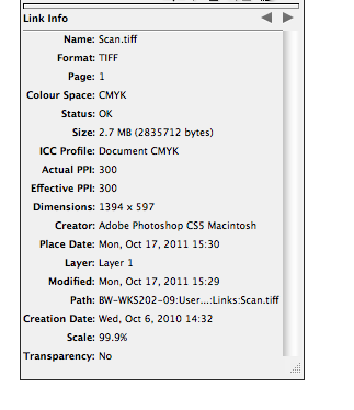
When an image is selected its information (size etc) is present in the links panel...
These pieces of information show us how the image has been resized in indesign....
So open the image in photoshop....
Go to image size settings
uncheck resample image.....
change resolution to 300dpi.....
check resample image again....
change the size to be the correct size for the indesign layout....
Save this and update link in indesign.
Now information is correct.
SPOT COLOURS
You would discuss appropriate stocks and bleeds with your printer. You would discuss what colour book to use according to your stock and depending on the spot colour/pantone.
You would never make this decision without discussing it first.
Offset litho - one plate per colour
Digital - 4 colour printing.
To see the channels or 'separations' go to window>output>separations preview....
Check that there are no unused spot colours so as to avoid accidental printing.
DON'T leave this to the printer - who won't necessarily check it for you.
check view>separations... to look at each printing plate separately...
This method can also be used to prepare screens for screen printing.
Notes on manual feed :
If you are printing in black and white, go to 'colour/quality options' (above 'finishing' under printer options on the print menu) and check 'print colour as gray' so that it will only charge you for a black and white print.