Monday, 7 November 2011

Print workshop 2 - Consistency and Efficiency

Master Pages


Labelled alphabetically A and so on...
Can be seen in Pages panel...


Master pages act as a template page - help to achieve consistency throughout your document.
Once you add an element to your master page it will appear on all the pages.
A good use of this would be page numbering.

adding page numbers....

Say you wanted an image in the same place on every left hand page - add a frame to the master left hand page.

You can have multiple master pages...

Simply dragging the new template on top of the pages you want it to be applied to enables this master page layout....

When editing a specific page - the master layout is locked (to allow consitency)
 - to unlock - hold cmd and shift and click on the item if you do need to edit the item.
To re-lock it go to object menu and lock. (cmd + L)


How to have different page sizes in the same inDesign file
This could be useful if using the same swatches/spot colours etc - for example multiple pieces of stationary for the same client.
Insert extra page.....
Then at the bottom of panel use menu to select page size.


Techniques when working with type

Hidden characters : dots in between words and paragraph symbols don't print but act as guides.

You can choose whether you want to see these characters through the type menu.


If you wanted to delete all the paragraph returns.....
Rather than manually deleting each one per page....
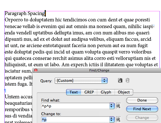
Put curser at start of text then find/change (cmd + F) - acts like a spell check search

find instances where two para breaks are together...
...and change to one paragraph break.

Click 'find' and it will highlight what you have searched for....

Then click 'change' and 'find next' and so on, or just 'change all'.

When formatting paragraphs its best to have the paragraph option selected - gives you more relevant options across top options bar...


You can manually edit the mm space in between paragraphs in the options along the top.....


This gives you much more control.
Other options in this toolbar include indenting etc.

The issue now is that now the new technique of editing this space is manual - not a global setting like the one before.

Tabs

Symbol for a tab is two arrows (show hidden characters)

Using the tab key isn't the best way of doing this....
(But to insert a tab, just press the tab key)


The tabs ruler is the best way - you can specify the distance between tabs.


'Leader' allows you to fill the space with a character :


If you want to keep all the content within the same paragraph, but still have it on separate lines then Shift + return key creates a 'soft return'.

How to create a body of indented text (after a heading).....

'Indent to here' or (cmd + \)

Cross symbol....


Ruled line/Reversing out text

How to reverse out text...
Type >paragraph
edit settings until it looks how you want.
You can change the colours and reformat the ruled line as you wish
How to apply all these elements to a multiple page document

Creating a style sheet

Format text of a paragraph..
type>paragraph styles>

>new paragraph style

name the new style and give it a numeric command

So you can then make global changes to the body text by editing the style sheet.

To apply it to other paragraphs, click on the paragraph and then click on 'body text' style sheet in paragraph panel.

My attempt at creating different paragraph styles...


'Character styles' are the same as 'paragraph styles', only character specific rather than paragraph specific. Just as useful if you want to format characters/text. More simple than paragraph styles.

NOTE : Booklet printing from indesign directly now works - rather than having to make a post script file.


toilet wall illustration

Strange but lovely illustration on a toilet wall I saw this weekend....

Trip to Saltaire

I went to Saltaire yesterday - partly for a break from the city for a couple of hours and partly to see the Hockney gallery again as I haven't been this year. Typically I spent more time in the amazing shop than anywhere else photographing things that I can't afford to buy and things that I just liked.

I absolutely love this typographic book cover. I think that the ribbon works really well as a guide - directing your eye down the cover.

A lot of the work I looked at will be really helpful for my research for both my type brief and my Fedrigoni brief....


I plan to make my own christmas cards this year and these designs I especially like. I plan to screen print my cards - partly to keep costs as low as possible but also for the aesthetic of hand made. What I particularly like about these cards are the colour choices - especially the orange and blue snowman and the green and pink/red ones. I like that they are slightly less obviously festive colours such as red green gold etc. 


Massive sandwich I ate later that day.....


woah


stock for tags

I found this amazing green satin heavy stock today in town - hoping to use it for my tags as part of the Ponya branding. I liked the idea of injecting a small amount of neutral colour into the identity. I also felt that the satin effect and weight of the card would add some luxury to the identity. 


Thursday, 3 November 2011

Analyzing image driven type

For my next brief I am focussing on creating a series of pieces of illustrated/experimental/3d type, each for a specific purpose, and then presenting them in an appropriate context. These are some examples of type that I think both work and don't work and a brief analysis of each.

Working Format Custom wordmark for Writeability, a professional writing services company based in Toronto.

This is an example of decorative type that functions as an extension of the literal translation of the word.
The typeface is fluid in its appearance - the letters and ligatures flow freely from one to the other giving the impression of joined up hand writing - and implies ease.


Non-Format
Nike SPARQ Training.

Upper case, bulky type - denotes power, strength and austerity.
The explosion effect achieved by the use of sharp angular shapes reinforces the them of power and creates an impacting image - like a freeze frame on some glass being broken. The statement is supposed to be short and succinct and impact on the reader, and the way that the type is illustrated helps to enforce this. It is not just the language that is evoking a reaction and an interpretation from the viewer.
Non-format are relying on the readability of the word rather than simply the legibility- the correct reading of each individual letter. The reader will understand and interpret the word correctly despite some of the letters being less legible and obscured by the other shapes.

Nike SPARQ Training image 1


E.g. 


I cnduo't bvleiee taht I culod aulaclty uesdtannrd waht I was rdnaieg. Unisg the icndeblire pweor of the hmuan mnid, aocdcrnig to rseecrah at Cmabrigde Uinervtisy, it dseno't mttaer in waht oderr the lterets in a wrod are, the olny irpoamtnt tihng is taht the frsit and lsat ltteer be in the rhgit pclae. The rset can be a taotl mses and you can sitll raed it whoutit a pboerlm. Tihs is bucseae the huamn mnid deos not raed ervey ltteer by istlef, but the wrod as a wlohe. Aaznmig, huh? Yaeh and I awlyas tghhuot slelinpg was ipmorantt! See if yuor fdreins can raed tihs too.


NY Times style magazine
Type design reflects the style of the clothing being presented as well as the image - tribal.
Type is being used as an illustration.

NY Times Style Magazine image 1

Print Magazine
 Type suits the content of the article.
Print image 1
Orange
Flowers floating and colour choices denote happiness, freedom, hippies.

Orange image 1
Hanne Hukkleberg
Here the type is almost completely unreadable/illegible without first being able to read the supporting title 'Rykestraase'. In this situation type is being used as a piece of ambiguous artwork rather than a functioning piece of design.
Hanne Hukkelberg image 1
Venice Biennale - Pompei
In this example the type acts as a freestanding illustration/poster design.
Again, the word that is being depicted is additionally communicated through the body text of the poster.
Does this mean that it does not serve its purpose as a communicative piece of type?
Is this therefore an illustration.....
Where is the defining line between illustrated typography and typographic illustration?
Venice Biennale – Pompei image 1
Back to black
This piece of type relies on the choice of stock to contradict the content of the words.
This is a perfect example of where in order for the intended message to be delivered effectively then words are not enough - design is important - in this case stock. However, this is not to say that a more minimalist Swiss style font could not have been used.
Back To Black image 1
Si Scott
Tiffany and Co. Christmas Card
This type is extremely flamboyant, luxurious and feminine. Not only the style of the typography, but the choice of stock, the print processes - (de-bossing and foiling) all give the impression of decadence and expense. I think that it is fair to say that without the aid of these elements - particularly the type, the same impression would not be made on the viewer/recipient.
tiffanys_card


David Carson
The Rules Of Graphic Design
In this piece of typographic design David Carson appears to deliberately break the suggested 'rules' of graphic design - directly contradicting the message that is read.
This is also another example of letters not being in the right position on the page (conventionally) - but the reader is still able to read the words correctly and in the right order.


Craig Ward
In this piece of typography work by Craig Ward the message is communicated by both the worded message and the media - the media becomes part of the message.

Similarly, for this poster Craig Ward created this blood effect to connote death and the human heart.

This typographic poster by Craig Ward allows to messages to be communicated simultaneously, which more conventional type and layout rules would not necessarily allow. Although the second layer is less easy to read, the red type is very readable, so your eye is guided through the poster, from one piece of text to the next beneath.


Steve Bonner
Sometimes I think that a custom typeface - such as this piece of type can help the viewers understanding of the words/language/tone of voice in addition or instead of colour/stock/image/format. For example, in this instance, this type reflects stereotypical typography associated with rock and roll, so before the viewer as even read the words, they have formed some element of understanding as to the context. Understandably this has both upsides and downsides; a badly chosen typeface could inadvertently miscommunicate the message to hand. However, a well chosen/designed piece of type could enhance the viewers understanding and interpretation of the text.

Happycentro 
This editorial header type reflects the theme of the article. I think that in this instance it acts as an illustration rather than a functioning piece of type.....

However in the example below I think that the design of the type helps to communicate the word 'poverty' due to the materials used to create it.


This piece of type design by Happycentro relies not only on the media - pastry, but the image itself and the surrounding elements. The pastry alone connotes pastry, but with the addition of the other elements it suggests baking, the spilled ingredients suggest a less professional environment; such as the home ('home baking'). The content of the words 'say hello to santa' put the image in a context - baking (perhaps traditionally mince pies) for santa claus. The words would not communicate the same message if they weren't supported by the image and vice versa. This is an example of the words and image being equally as important as each other in order to communicate a specific message.